
Evo uiUi elements
Dropdown
A highly customizable dropdown list
This page documents Evo UI v1. For the current version, see Evo UI v2. Upgrading? Read the migration guide.
Overview
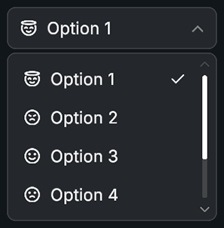
Dropdown displays a list of selectable items inside an animated panel. It supports icons, auto positioning based on screen space, and multiple animation types such as fade, scale, and slide.
Customization
Header Button
The dropdown's header is essentially a button, which can be found under Dropdown Object -> Header Button. You can select this object and customize it as needed. You can also access it via script using dropdown.headerButton and make use of all the button features.
Dropdown Item
- Locate the default item prefab in the References foldout
- Open the prefab and customize it as needed
Create New Item Presets
You can create different item prefabs and use them on different dropdowns. To create a new item prefab:
- Locate the default item prefab in the References foldout
- Duplicate the prefab (this is the fastest way to customize)
- Open the new prefab and customize it to your liking
Properties
Item List
| Name | Type | Description |
|---|---|---|
selectedIndex | int | Index of currently selected item |
items | List<Item> | List of dropdown items |
Item Layout
| Name | Type | Description |
|---|---|---|
itemSpacing | int | Vertical spacing between item buttons |
itemHeight | float | Height of each item button |
padding | RectOffset | Inner padding of the items area |
Settings
| Name | Type | Description |
|---|---|---|
scrollbarPosition | ScrollbarPosition | Scrollbar positioning method |
maxHeight | float | Maximum scroll view height |
blockUIWhileOpen | bool | Creates a fullscreen blocker behind dropdown |
closeOnItemSelect | bool | Closes dropdown on item selection |
closeOnClickOutside | bool | Closes dropdown when clicking outside |
rotateArrow | bool | Rotates arrow when dropdown opens |
arrowRotation | float | Rotation applied when open |
Animation
| Name | Type | Description |
|---|---|---|
animationType | AnimationType | Fade, Scale, or Slide |
animationDuration | float | Duration of open and close animations |
animationCurve | AnimationCurve | Controls easing behavior |
References
| Name | Type | Description |
|---|---|---|
itemPrefab | GameObject | Prefab for item entries |
itemParent | Transform | Parent transform for item objects |
headerButton | Button | Header button controlling open and close |
headerArrow | Image | Arrow graphic on header (optional) |
scrollRect | ScrollRect | Scroll view containing items |
canvasGroup | CanvasGroup | Controls visibility and fading |
Events
| Name | Type | Description |
|---|---|---|
onItemSelected | UnityEvent<int> | Called when an item is selected |
onOpen | UnityEvent | Called when dropdown opens |
onClose | UnityEvent | Called when dropdown closes |
Public Methods
| Name | Parameters | Description |
|---|---|---|
Toggle() | None | Opens or closes dropdown |
Open() | None | Opens dropdown with animation |
Close() | None | Closes dropdown with animation |
UpdateUI() | None | Updates header and layout |
SelectItem(index, triggerEvents) | int, bool | Selects item at index |
SelectItem(item, triggerEvents) | Item, bool | Selects item by reference |
SelectItem(label, triggerEvents) | string, bool | Selects item by label |
AddItem(item, generate) | Item, bool | Adds item optionally generating UI |
AddItem(label, icon, generate) | string, Sprite, bool | Adds item by label and icon |
AddItems(newItems) | params Item[] | Adds multiple items |
AddItems(labels) | params string[] | Adds multiple string items |
RemoveItem(index) | int | Removes item at index |
RemoveItem(label) | string | Removes item by label |
ClearAllItems() | None | Removes all items |
SortAlphabetically(ascending) | bool | Sorts items |
Code Example
using UnityEngine;
using Evo.UI;

public class DropdownExample : MonoBehaviour
{
    public Dropdown dropdown;

    void Start()
    {
        // Add item
        dropdown.AddItem("New Item");

        // Add item with icon
        Sprite myIcon = null;
        dropdown.AddItem("New Item", myIcon);

        // Add items
        dropdown.AddItems("Option A", "Option B", "Option C");

        // Remove items
        dropdown.RemoveItem("Item Label"); // using label
        dropdown.RemoveItem(0); // using index

        // Open event
        dropdown.onOpen.AddListener(() =>
        {
            Debug.Log("Dropdown opened");
        });

        // Close event
        dropdown.onClose.AddListener(() =>
        {
            Debug.Log("Dropdown closed");
        });

        // Select event
        dropdown.onItemSelected.AddListener(index =>
        {
            Debug.Log("Selected index: " + index);
        });

        // Manually select item
        dropdown.SelectItem(1);

        // Open dropdown
        dropdown.Open();

        // Set header text or sprite icon
        dropdown.headerButton.SetText("Select an item");
        dropdown.headerButton.SetIcon(null);
    }
}