
Quick Start
Learn the basics and get Evo UI up and running
Compatibility
Make sure your project meets the following requirements.
Supported:
✅ Unity 7
✅ Unity 6
Not supported:
🟥 Unity 2022.3 and earlier
Dependencies
Evo UI is built on uGUI and relies on Unity’s Input System. Both packages are included with Unity by default and should already be installed unless they were manually removed.
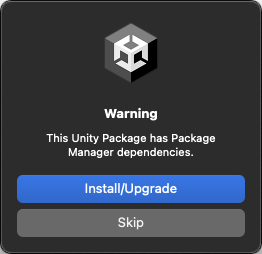
If Unity prompts you about dependencies, click Install/Upgrade to ensure that all required packages are installed in your project.
TextMesh Pro is the default text provider. Import TMP Essential Resources if prompted. To use UniText instead, install its package and select it in Project Settings -> Evo UI. See Text Providers.
Creating Content
Catalog
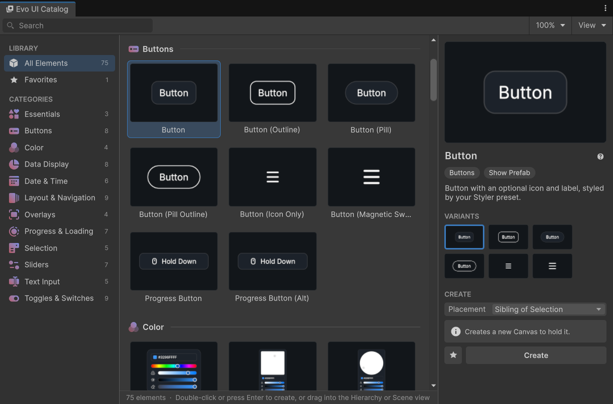
The UI Catalog shows everything in the Create menu with rendered previews, grouped by category. Open it from Tools -> Evo UI -> UI Catalog, or select Open Catalog... at the top of the Create menu.
Pick a category, or search by name or keyword, such as "date" or "loading".
Select an element to see its description, variants, and documentation link.
Double-click it, press Enter, or click Create. You can also drag it into the Hierarchy or Scene view.
Placement sets where new elements go: next to the selected object (default), inside it, or at the root of its Canvas. Mark elements you use often as favorites to find them in the Favorites list.
Create Menu
Use the built-in Create menu to add Evo UI elements. You can also access the same menu by right-clicking in the Hierarchy or on an object.
Components
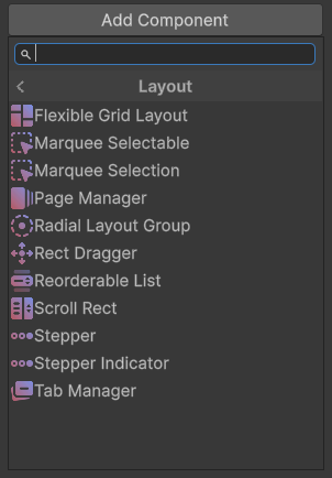
Select an object and click the Add Component button. From there, you can either open the Evo -> UI section or search directly for the component you need.
Customization
Use Styler for shared colors, fonts, icons, audio, and shape styles. Keep custom preset assets outside the package folder so replacing the package does not remove your work.
Use Procedural Shape for local corners, fills, outlines, shadows, and clipping. Buttons and other controls expose their content through properties such as Text and Icon.
Use Tween Animator for custom motion. You can connect the animator to an interactable object, such as a Button.
Scene View Picking
Unity picks UI in the Scene view by RectTransform, so a click often selects an empty container or an invisible hit area. Evo UI changes this: clicking UI selects the top-most graphic that is drawn under the cursor. Empty objects, fully transparent graphics, masked-out parts, and objects hidden in the Hierarchy are skipped.
Clicking again on the same spot still cycles through everything under the cursor, including the skipped objects. Clicks on 3D objects and other non-UI content work as before.
To use Unity's default picking, turn off Tools -> Evo UI -> Pick Visible UI in Scene View.
Docs Shortcut
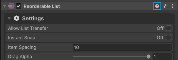
Click a component's Help icon to open its documentation page.
Explore Further
Evo UI uses Unity's UI system (uGUI). Familiarity with it will help you get more out of the package. See the official uGUI documentation to learn the basics.
Continue exploring with these pages:
Frequently asked questions
Check out the commonly asked questions.
Styler
Share colors, shapes, and more across your UI.