
Procedural Shape
Build scalable UI shapes with fills, outlines, shadows, and blur
Overview
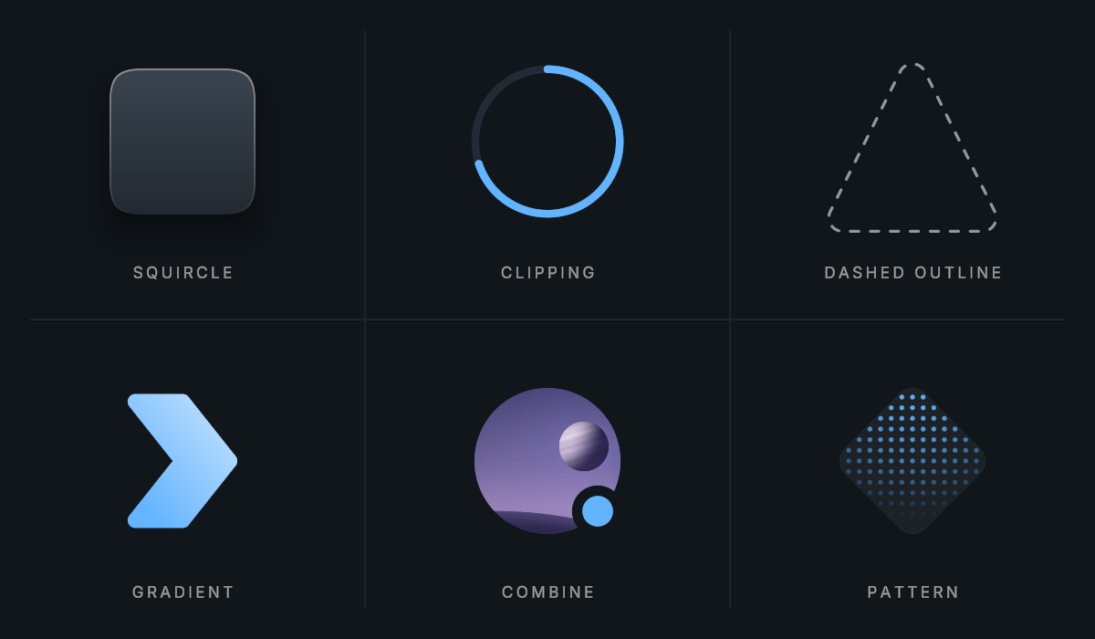
Procedural Shape is the graphic renderer used throughout Evo UI. It draws a shape based on a shader instead of relying on a separate sprite for every radius or outline. A single component can combine a fill, outline, inner shadow, outer shadow, and an optional image.
Usage
Add Procedural Shape to a UI object, or start with an Evo UI element that already uses one.
Choose the shape and tweak it to your needs.
Set the fill color mode and color, or assign a sprite.
Add an outline, corner radius, or shadows as needed.
Customization
Shape and Image
- Choose Rectangle, Ellipse, Polygon, Star, Heart, or Chevron.
- Shape Angle rotates the graphic, and Shape Skew shears it on either axis without changing the layout rectangle.
- Stretch fills the rectangle without preserving the image’s aspect ratio, Cover fills and crops, and Fit preserves the image aspect ratio (or 1:1 when there is no image).
- Assign a portrait sprite and round its corners to make an avatar without a separate mask object.
Corners and Radius Sync
- Choose pixel or percentage radius units. Percentage values run from 0 to 100, where 100 is half the shorter side of the drawing rectangle.
- Rectangles can use independent corners and squircle corners; other supported shapes use a uniform radius, and ellipses do not use corner radii.
- Match Parent or Match Target derives a rectangle’s radius from another Procedural Shape while accounting for the space between them. This is useful for inset panels and borders. Radius synchronization applies to rectangles.
- Match Ancestor finds the source by itself, so it works for objects created at runtime, such as context menu or list items. Leave Target Name empty to use the nearest parent with a Procedural Shape. Enter a name, or a path like
Frame/Background, to use the nearest object with that name under any parent. Found shows the shape it picked. - A synced shape uses one radius on every corner, even when its padding differs per side, such as next to a scrollbar. Turn on independent corners (the link button) to fit each corner to its own padding instead.
- Synced shapes update when their source changes size or radius. The search runs again when the shape or one of its parents moves. At runtime, call
UpdateRect()after you create, rename, or move the source in another branch.
Fills, Outlines, and Shadows
- Each layer can use the Graphic’s base color, its own custom color, a gradient, Styler colors, or a Styler gradient.
- A layer’s color mode determines which settings are used.
- Fill Center can be disabled for an outline-only shape.
- Gradients can be Linear, Radial, or Angular. Local space maps the gradient to the shape; Screen Space maps it across the screen so separate shapes can share a continuous gradient. Angle, zoom, and reverse control its appearance.
- The outline is drawn inward. Dashed outlines have independent dash length, gap, offset, and rounded ends.
- Dash offset is measured in repeats: adding 1 moves the pattern by one dash and gap.
- Inner and outer shadows each have offset, size, softness, color, and gradient settings.
- Outer Shadow Outside Only keeps the outer shadow out of the original shape’s interior.
Dithering
Large soft shadows and slow gradients can show visible steps (banding) on 8-bit screens. Enable Dither to add faint noise of about one color level, which hides the steps.
- Use it on big, soft graphics such as glows and background gradients. Most shapes don’t need it.
- The noise pattern is fixed and doesn’t flicker.
- Colors can differ from the set color by about one level, so leave it off where exact color values matter.
Clipping and Progress
- Use Horizontal, Vertical, or Radial360 clipping with a ClipAmount from 0 to 1.
- Set ClipOrigin for the starting edge and ClipClockwise for radial direction.
- Rounded Clip Edges preserves corner radii on horizontal/vertical rectangle fills, or rounds the ends of an outline-only radial fill.
Patterns
- Enable Fill Pattern to overlay repeating shapes or sprites.
- Tile size and gap use local pixels; offset and angle move the pattern within the fill.
- Pattern Falloff fades it with distance from an anchor, useful for decoration that gets quieter near text.
- Sprite tiles preserve their aspect ratio.
- If the fill also uses a sprite, both sprites must use the same atlas texture.
- Disable tight packing and atlas rotation for the pattern sprite.
Combining Shapes
Shape Operations combines up to four other shapes in order using Union, Subtract, Intersect, or Exclude. For example, subtract an ellipse from a rectangle to make a cutout.
- Smoothing rounds the join between shapes.
- Targets must be active, coplanar, and on the same root Canvas.
- Enable Operand Only on a target to use its geometry without drawing it or receiving raycasts.
- Operations sample each target's primitive and clipping, not its colors, shadows, or nested operations.
- The resulting shape uses the owner's styling and automatic material.
Sprite Export
Open the component's context menu and choose Export Sprite to save a PNG in the project. The result is a static sprite, so it no longer responds to shape properties or Styler transitions.
Integrations
Styler and Interaction
A Shape Style can override selected groups of settings, so one preset can share corners or outlines without replacing every local choice. For state colors or gradients, choose Styler or Styler Gradient on the relevant layer, enable its interaction mapping, and assign the Selectable that supplies the state. Fill, pattern, outline, and both shadows have separate mappings.
Ripple, Spotlight, and Border Glow support Procedural Shape. Configure them through an Interactive component or their standalone components.
Masking and Input
Procedural Shape participates in Unity UI masking and supports Soft Mask. Use its own sprite and shape settings when you only need to crop that graphic; add a mask when child graphics also need clipping.
Standard raycasts use the rectangle; Shape follows the procedural geometry; None disables hits. Shape mode does not test sprite alpha. Decorative graphics usually need no raycast target.
Backdrop Blur
Enable Backdrop Blur for a camera-blurred fill. It shares settings and capture behavior with Backdrop Blur, including its camera, render-pipeline, and overlay-UI restrictions.
Performance
Procedural Shape shares materials and style data between compatible shapes on the same Canvas, so multiple shapes can often render in a single draw call. Different sprite textures, masks, blur settings, effects, custom materials, and rendering order can still split batches. Each shape uses a single quad, but that doesn’t guarantee a single draw call for the entire UI.
Compared with a regular Image, Procedural Shape offers more flexibility, with a generally higher GPU cost. It can combine several visual layers into one component and handle some updates with less CPU work. Neither option is always faster, the result depends on your UI and how you animate it.
Dither has no cost on shapes that leave it off, and it doesn’t split batches. Shapes that use it cost slightly more to draw, so enable it only where banding is visible.
Roadmap
- Shader variants: Currently, Procedural Shape is an uber shader, which is good for batching but can be more demanding on the GPU. I'm experimenting with shader variants, which may increase the batch count but could improve GPU performance with little to no additional CPU overhead. For example, shapes without gradients or shadows could use a lightweight shader variant, similar to an LOD system.
- Bezier editing for polygon shape: This feature will allow you to create virtually any shape (with up to 8 corners), such as a lightning bolt. It will include an editor tool and support runtime manipulation.
Public API
Use ProceduralShape in the Evo.UI namespace.
Property setters request their own updates. After changing public fields or editing a Gradient, style mapping, or blur settings object in place, call UpdateRect(). Shape Style overrides can replace local settings in the groups they control.
Properties
Shape and Image
| Name | Type | Description |
|---|---|---|
Shape | ShapeType | Rectangle, Ellipse, Polygon, Star, Heart, or Chevron. |
PolygonSides | int | Polygon side count, clamped to 3–8. |
ShapeAngle | float | Rotation inside the drawing rectangle, in degrees. |
ShapeSkew | Vector2 | X/Y skew in degrees, each clamped to -60–60. |
Sprite | Sprite | Optional source image. |
ImageScaleMode | ScaleMode | Stretch, Cover, or Fit. |
RaycastDetectionMode | RaycastMode | None, Standard, or Shape hit detection. |
Softness | float | Extra edge softness in pixels. |
Dither | bool | Adds faint noise that hides banding in soft shadows and gradients. |
Corners
| Name | Type | Description |
|---|---|---|
CornerRadiusMode | RadiusMode | Pixels or Percentage. |
CornerRadius | Vector4 | Radii in top-left, top-right, bottom-right, bottom-left order. |
UniformCornerRadius | float | Sets a common radius. |
IndependentCorners | bool | Uses individual radii on a rectangle. With Radius Sync, each corner fits its own padding. |
SquircleCorners | bool | Uses smooth squircle corners on a rectangle. |
RadiusSynchronizationMode | RadiusSyncMode | None, MatchParent, MatchTarget, or MatchAncestor. |
RadiusSyncTarget | ProceduralShape | Reference for MatchTarget. |
RadiusSyncTargetName | string | Name or relative path MatchAncestor looks for under each parent. Empty uses the nearest parent shape. |
RadiusSyncSource | ProceduralShape | Read-only. The shape the radius currently syncs to, or null. |
Fill
| Name | Type | Description |
|---|---|---|
FillCenter | bool | Draws the interior. |
FillColor | Color | Solid fill color used in Custom mode. |
FillGradient | Gradient | Gradient; call UpdateRect after in-place edits. |
FillGradientType | GradientType | Linear, Radial, or Angular. |
FillGradientSpace | GradientSpace | Local or ScreenSpace coordinates. |
FillGradientAngle | float | Gradient angle in degrees. |
FillGradientZoom | float | Gradient scale. |
FillGradientReverse | bool | Reverses gradient direction. |
Pattern Layout
| Name | Type | Description |
|---|---|---|
FillPattern | bool | Enables the repeating fill overlay. |
PatternType | PatternSource | Shape or Sprite tiles. |
PatternSprite | Sprite | Sprite tile; must be compatible with the fill texture. |
PatternSpriteCompatible | bool | Read-only; whether the sprite meets the pattern texture and packing requirements. |
PatternShape | ShapeType | Procedural tile shape. |
PatternPolygonSides | int | Polygon tile side count, clamped to 3–8. |
PatternRadius | float | Tile corner radius in local pixels. |
PatternSize | Vector2 | Tile bounds in local pixels. |
PatternGap | Vector2 | Space between tiles in local pixels. |
PatternOffset | Vector2 | Translation before pattern rotation, in local pixels. |
PatternAngle | float | Pattern rotation in degrees. |
PatternFalloff | bool | Fades tiles with distance from an anchor. |
PatternFalloffOrigin | Vector2 | Anchor from (0, 0) at bottom-left to (1, 1) at top-right. |
PatternFalloffStart | float | Distance where fading begins, in local pixels. |
PatternFalloffEnd | float | Distance where tiles become invisible, in local pixels. |
Pattern Colors
| Name | Type | Description |
|---|---|---|
PatternColor | Color | Custom pattern color. |
PatternGradient | Gradient | Pattern gradient. |
PatternGradientType | GradientType | Linear, Radial, or Angular. |
PatternGradientSpace | GradientSpace | Local or ScreenSpace coordinates. |
PatternGradientAngle | float | Pattern gradient angle in degrees. |
PatternGradientZoom | float | Pattern gradient scale. |
PatternGradientReverse | bool | Reverses the pattern gradient. |
Outline
| Name | Type | Description |
|---|---|---|
OutlineWidth | float | Inward outline thickness in pixels. |
OutlineColor | Color | Custom outline color. |
OutlineGradient | Gradient | Outline gradient. |
OutlineGradientType | GradientType | Linear, Radial, or Angular. |
OutlineGradientSpace | GradientSpace | Local or ScreenSpace coordinates. |
OutlineGradientAngle | float | Outline gradient angle. |
OutlineGradientZoom | float | Outline gradient scale. |
OutlineGradientReverse | bool | Reverses the outline gradient. |
OutlineDashed | bool | Enables a dashed outline. |
OutlineDashLength | float | Dash length in local pixels. |
OutlineDashGap | float | Gap between dashes in local pixels. |
OutlineDashOffset | float | Pattern offset in repeats. |
OutlineDashRounded | bool | Rounds dash ends. |
Clipping
| Name | Type | Description |
|---|---|---|
ClippingMethod | ClipMethod | None, Horizontal, Vertical, or Radial360. |
ClipOrigin | int | Starting edge/direction for clipping. |
ClipAmount | float | Visible amount from 0 to 1. |
ClipClockwise | bool | Radial clipping direction. |
RoundedClipEdges | bool | Rounded supported clip ends. |
Inner Shadow
| Name | Type | Description |
|---|---|---|
InnerShadowOffset | Vector2 | Inner-shadow offset. |
InnerShadowSize | float | Inner-shadow expansion. |
InnerShadowSoftness | float | Inner-shadow blur radius. |
InnerShadowColor | Color | Custom inner-shadow color. |
InnerShadowGradient | Gradient | Inner-shadow gradient. |
InnerShadowGradientType | GradientType | Linear, Radial, or Angular. |
InnerShadowGradientSpace | GradientSpace | Local or ScreenSpace coordinates. |
InnerShadowGradientAngle | float | Inner-shadow gradient angle in degrees. |
InnerShadowGradientZoom | float | Inner-shadow gradient scale. |
InnerShadowGradientReverse | bool | Reverses the inner-shadow gradient. |
Outer Shadow
| Name | Type | Description |
|---|---|---|
OuterShadowOffset | Vector2 | Outer-shadow offset. |
OuterShadowSize | float | Outer-shadow expansion. |
OuterShadowSoftness | float | Outer-shadow blur radius. |
OuterShadowOutsideOnly | bool | Excludes shadow from the original interior. |
OuterShadowColor | Color | Custom outer-shadow color. |
OuterShadowGradient | Gradient | Outer-shadow gradient. |
OuterShadowGradientType | GradientType | Linear, Radial, or Angular. |
OuterShadowGradientSpace | GradientSpace | Local or ScreenSpace coordinates. |
OuterShadowGradientAngle | float | Outer-shadow gradient angle in degrees. |
OuterShadowGradientZoom | float | Outer-shadow gradient scale. |
OuterShadowGradientReverse | bool | Reverses the outer-shadow gradient. |
Backdrop Blur
| Name | Type | Description |
|---|---|---|
BackdropBlurEnabled | bool | Enables the blurred fill. |
BackdropBlurSettings | BackdropBlur.Settings | Shared BackdropBlur.Settings configuration. |
Styling
| Name | Type | Description |
|---|---|---|
Preset | StylerPreset | Styler preset used by the shape. |
Shape Operations
| Name | Type | Description |
|---|---|---|
OperandOnly | bool | Supplies operation geometry without drawing or receiving raycasts. |
ShapeOperationCount | int | Read-only count of configured operations, up to four. |
Fields
Styling and Interaction
| Name | Type | Description |
|---|---|---|
shapeStyleID | string | Shape Style ID within that preset. |
useDefaultStylerPreset | bool | Locks the preset to the current default Styler Preset. |
interactableObject | Selectable | Selectable that supplies interaction states. |
Fill
| Name | Type | Description |
|---|---|---|
fillColorMode | ColorMode | Base, Custom, Gradient, Styler, or StylerGradient fill. |
fillStyler | Styler.ColorStyle | Fill color and state mappings. |
fillGradientStyler | Styler.GradientStyle | Fill gradient and state mappings. |
Pattern
| Name | Type | Description |
|---|---|---|
patternColorMode | ColorMode | Source of pattern color. |
patternStyler | Styler.ColorStyle | Pattern color and state mappings. |
patternGradientStyler | Styler.GradientStyle | Pattern gradient and state mappings. |
Outline
| Name | Type | Description |
|---|---|---|
outlineColorMode | ColorMode | Source of outline color. |
outlineStyler | Styler.ColorStyle | Outline color and state mappings. |
outlineGradientStyler | Styler.GradientStyle | Outline gradient and state mappings. |
Shadows
| Name | Type | Description |
|---|---|---|
innerShadowColorMode | ColorMode | Source of inner-shadow color. |
outerShadowColorMode | ColorMode | Source of outer-shadow color. |
innerShadowStyler | Styler.ColorStyle | Inner-shadow color and state mappings. |
outerShadowStyler | Styler.ColorStyle | Outer-shadow color and state mappings. |
innerShadowGradientStyler | Styler.GradientStyle | Inner-shadow gradient and state mappings. |
outerShadowGradientStyler | Styler.GradientStyle | Outer-shadow gradient and state mappings. |
Methods
| Name | Parameters | Description |
|---|---|---|
UpdateRect() | None | Refreshes geometry/materials after direct field or in-place edits. |
UpdateStyler() | None | Resolves preset settings and interaction mappings. |
GetDrawingRect() | None | Returns the resolved drawing rectangle. Returns Rect. |
GetRadiiPixels() | Rect rect | Resolves radii in pixels for a rectangle. Returns Vector4. |
SetShapeOperations() | ShapeOperation[] operations | Retains the supplied array; accepts up to four operations. Pass null or an empty array to clear it. |
GetShapeOperation() | int index | Returns a copy of a configured ShapeOperation. |
SetShapeOperation() | int index, ShapeOperation value | Replaces an existing operation and clamps its smoothing to 0–1. |
ShapeOperation contains target (ProceduralShape), operation (OperationType), and smoothing (float, 0–1). OperationType is Union, Subtract, Intersect, or Exclude. Use a valid index below ShapeOperationCount when reading or replacing an entry.
Example
using UnityEngine;
using Evo.UI;

public class ProceduralShapeExample : MonoBehaviour
{
    [SerializeField] private ProceduralShape target;

    private void Start()
    {
        // Shape and corners
        target.Shape = ProceduralShape.ShapeType.Rectangle;
        target.CornerRadiusMode = ProceduralShape.RadiusMode.Pixels;
        target.UniformCornerRadius = 20f;

        // Select the color sources before assigning their values
        target.fillColorMode = ProceduralShape.ColorMode.Custom;
        target.FillColor = new Color(0.12f, 0.15f, 0.22f);

        // Outline parameters
        target.outlineColorMode = ProceduralShape.ColorMode.Custom;
        target.OutlineWidth = 2f;
        target.OutlineColor = Color.cyan;
        target.OutlineDashed = true;
        target.OutlineDashLength = 12f;
        target.OutlineDashGap = 6f;

        // Pattern parameters
        target.FillPattern = true;
        target.PatternType = ProceduralShape.PatternSource.Shape;
        target.PatternShape = ProceduralShape.ShapeType.Ellipse;
        target.PatternSize = new Vector2(3f, 3f);
        target.PatternGap = new Vector2(12f, 12f);
        target.patternColorMode = ProceduralShape.ColorMode.Custom;
        target.PatternColor = new Color(1f, 1f, 1f, 0.12f);

        target.UpdateRect(); // Force apply the color-mode fields changed above
    }

    public void SetProgress(float progress)
    {
        target.ClippingMethod = ProceduralShape.ClipMethod.Horizontal;
        target.RoundedClipEdges = true;
        target.ClipAmount = Mathf.Clamp01(progress);
    }
}