
UI Elements
Comparison Slider
Reveal two images with a draggable divider
Overview
Comparison Slider reveals one image over another as the handle moves. It is useful for before-and-after views, graphics comparisons, and visual previews.
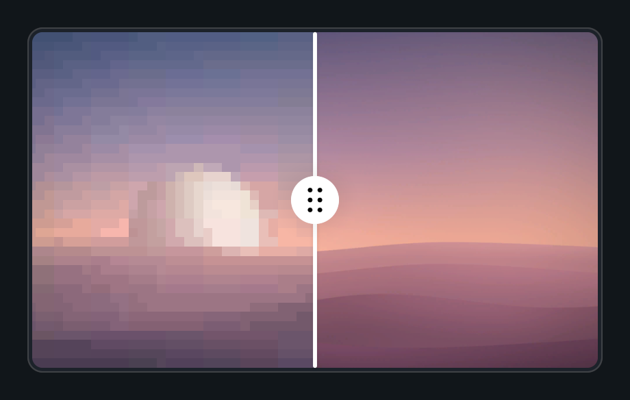
Usage
Create a Comparison Slider prefab.
Assign First Image and Second Image as Procedural Shapes and set their sprites.
Choose a horizontal or vertical split.
Customization
- Enable Click To Move to jump to the pointer, or Drag On Hover to follow it without a press.
- Reverse swaps the reveal direction. Auto Height can derive the layout from the image aspect ratio.
Public API
Use ComparisonSlider in the Evo.UI namespace.
Properties
| Name | Type | Description |
|---|---|---|
Value | float | Normalized divider position from 0 to 1. |
FirstSprite | Sprite | Sprite assigned to the first shape. |
SecondSprite | Sprite | Sprite assigned to the second shape. |
SliderOrientation | Orientation | Horizontal or vertical comparison. |
Reverse | bool | Reverses the reveal direction. |
AutoHeight | bool | Automatically sizes height from the image aspect. |
Padding | float | Content padding. |
Methods
| Name | Parameters | Description |
|---|---|---|
SetReferences() | ProceduralShape first, ProceduralShape second, RectTransform handle = null, RectTransform divider = null | Assigns image shapes and optional handle/divider references. |
SetValueWithoutNotify() | float input | Changes the split without invoking listeners. |
Refresh() | None | Refreshes clipping and layout. |
Events
| Name | Type | Description |
|---|---|---|
onValueChanged | UnityEvent<float> | Invoked with normalized position. |
Example
using UnityEngine;
using Evo.UI;

public class ComparisonSliderExample : MonoBehaviour
{
    [SerializeField] private ComparisonSlider target;

    private void Start()
    {
        target.Value = 0.5f;
        target.SliderOrientation = ComparisonSlider.Orientation.Horizontal;
        target.onValueChanged.AddListener(value => Debug.Log($"Reveal: {value:P0}"));
    }
}