
UI Elements
Switch
A toggle with animated on and off states
Overview
Switch represents a boolean setting. It combines an animated handle with Interactive input and optional on/off visual groups.
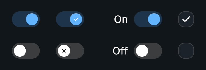
Usage
Create a Switch prefab.
Choose its initial state.
Connect On Value Changed to a method accepting a boolean.
Customization
- Adjust Handle Duration and its curve for the slide animation.
- The on/off CanvasGroups are the switch’s content states, separate from Interactive’s hover and pressed colors.
Public API
Use Switch in the Evo.UI namespace.
Properties
| Name | Type | Description |
|---|---|---|
IsOn | bool | Gets or sets the toggle state. |
Fields
| Name | Type | Description |
|---|---|---|
handleDuration | float | Duration of the handle transition. |
Methods
| Name | Parameters | Description |
|---|---|---|
SetValue() | bool value | Sets the state with change events enabled. |
SetValue() | bool value, bool invokeEvents | Sets the state. Pass false for invokeEvents to suppress events. |
Toggle() | None | Inverts the current value. |
Events
| Name | Type | Description |
|---|---|---|
onValueChanged | UnityEvent<bool> | Invoked with the new boolean value. |
Example
using UnityEngine;
using Evo.UI;

public class SwitchExample : MonoBehaviour
{
    [SerializeField] private Switch target;

    private void Start()
    {
        target.SetValue(true, invokeEvents: false); // Restore the initial setting.
        target.onValueChanged.AddListener(OnMusicChanged);
    }

    public void MuteMusic()
    {
        target.IsOn = false; // Updates the visuals and notifies listeners if changed.
    }

    private void OnMusicChanged(bool enabled)
    {
        Debug.Log($"Music: {enabled}");
    }

    private void OnDestroy()
    {
        if (target != null)
            target.onValueChanged.RemoveListener(OnMusicChanged);
    }
}