
Tooltip
Contextual help on hover or selection
Overview
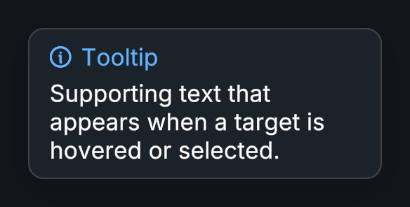
Tooltip displays supporting text when a target is hovered or selected. It can follow the cursor, anchor beside its target, or display custom content.
Usage
Add Tooltip to the target and assign Content -> Tooltip -> Preset. The supplied prefab is Evo UI/Prefabs/Overlays/Tooltip Preset.
Set Title, Description, and an optional icon.
Customize the options to your needs.
Customization
Creating a New Preset
A tooltip preset is a prefab with Tooltip Preset on its root. Duplicate the supplied prefab into your own project folder, or make a prefab variant, then open it in Prefab Mode.
Edit its background, typography, spacing, and icon layout. Keep the Title Text, Description Text, Icon Image, and layout references assigned on Tooltip Preset. Its Open Animation and Close Animation sequences control how the tooltip appears and disappears. Save the prefab and assign it to the target's Preset field.
Custom Content
Assign a UI prefab to Custom Content for a completely different layout, such as an item card. This takes priority over Preset: Tooltip positions the instance, but does not fill in its title, description, icon, or standard width layout. Configure those on the custom prefab. Add Tooltip Preset to its root if you want to configure its animation sequences.
Closed tooltips are reused instead of destroyed. Scripts on custom content receive OnEnable and OnDisable each time it shows and closes, but Awake and Start run only once.
Positioning
Use Max Width to wrap standard tooltip text, and adjust the offset and screen-edge padding to keep it readable. For scene objects, enable Is 3D Object and use a Collider so pointer hover can be detected. Target Canvas lets you choose where the tooltip renders; otherwise a default canvas is used.
Public API
Use Tooltip in the Evo.UI namespace.
Properties
| Name | Type | Description |
|---|---|---|
Title | string | Tooltip title. |
Description | string | Supporting text. |
Icon | Sprite | Optional icon. |
Instance | TooltipPreset | The TooltipPreset that is shown or closing, or null. Closed tooltips are reused, so don't keep this reference after it closes. |
IsVisible | bool | Whether the tooltip is shown or closing. |
Static Properties
| Name | Type | Description |
|---|---|---|
MaxPoolSize | int | Number of closed tooltips kept for reuse, shared by all tooltips. The default is 3. Set it to 0 to destroy them on close. |
Fields
| Name | Type | Description |
|---|---|---|
showDelay | float | Delay before showing. |
followCursor | bool | Follows pointer movement. |
maxWidth | float | Maximum content width. |
tooltipPreset | GameObject | Prefab used for standard tooltip content. |
customContent | GameObject | Custom prefab that takes priority over tooltipPreset. |
Methods
| Name | Parameters | Description |
|---|---|---|
Show() | None | Shows the tooltip. |
Hide() | None | Closes with animation. |
HideImmediate() | None | Closes immediately. |
SetContent() | string newTitle, string newDescription, Sprite newIcon = null, GameObject newCustomContent = null | Sets the title, description, and optional icon or custom content. |
SetContent() | GameObject newCustomContent | Sets a custom content object. |
Events
| Name | Type | Description |
|---|---|---|
onShow | UnityEvent | Tooltip shown. |
onHide | UnityEvent | Tooltip hidden. |
Example
using UnityEngine;
using Evo.UI;

public class TooltipExample : MonoBehaviour
{
    [SerializeField] private Tooltip target;
    [SerializeField] private Sprite cloudIcon;

    private void Start()
    {
        target.SetContent("Cloud save",
            "Keep your progress available on another device.", cloudIcon);
        target.showDelay = 0.3f;
    }

    public void SetCloudSaveAvailable(bool available)
    {
        // Content properties also refresh a tooltip that is already visible.
        target.Description = available
            ? "Your progress is synced."
            : "Connect to the internet to sync your progress.";
    }
}