
Dropdown
Single or multiple selection with filtering and recycled items
Overview
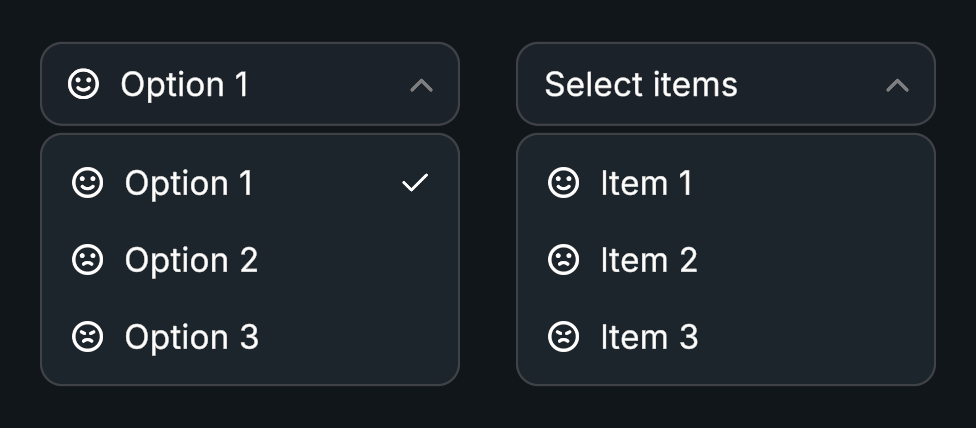
Dropdown displays a list of choices from a compact header. Dropdown Multi Select uses the same item model for multiple choices, and both support filtering and recycled views for large lists.
Usage
Create a Dropdown prefab and populate Items.
Set its starting selection and maximum open height.
Bind On Item Selected to receive the selected index.
Enable virtualization on the linked Scroll Rect for long lists.
Customization
Filtering and Multiple Selection
Use the Dropdown - Input prefab for a searchable list, or Dropdown - Multi Select when several choices can be selected at once. Dropdown Input connects an input field from any text provider to the list's filter.
Presets and Item Prefabs
Dropdown uses a complete dropdown prefab plus an Item Prefab for its rows. The supplied versions are in Evo UI/Prefabs/Selection.
Duplicate the dropdown prefab and its item prefab into your own project folder, or create prefab variants.
Edit the row's background, label, icon, and styling in Prefab Mode. Keep the Evo UI Button component on the row root and its content references assigned. For multiple selection, keep Dropdown Multi Select Item and its checkmark reference too.
On your dropdown prefab, open References and assign the new Item Prefab. Keep Header Button, Scroll Rect, and Item Parent connected to the corresponding objects in the hierarchy.
Adjust the header and list panel, then use your dropdown prefab in the scene. Match Item Height to the row design, especially with virtualization.
Changing the item prefab affects every row generated from it. Keep the row's label and icon objects enabled in the prefab if your items use them.
Appearance and Animation
Use item height, spacing, padding, and scrollbar placement to shape the list. Edit Open Animation and Close Animation as Evo Tween sequences.
Performance
For long lists, enable virtualization on the linked Scroll Rect. It reuses a small set of row objects as you scroll. Keep application data in items and avoid retaining generated view references.
Public API
Use Dropdown in the Evo.UI namespace.
Selection indices refer to the source item list, even when filtering hides some entries. Pass an empty string to SetFilter() to show the full list again.
Properties
| Name | Type | Description |
|---|---|---|
SelectedIndex | int | Current selection index. |
SelectedItem | Item | Read-only selected item. |
IsOpen | bool | Whether the dropdown is open. |
IsVirtualized | bool | Whether the list uses virtualization. |
VisibleItemCount | int | Number of entries matching the filter. |
Fields
| Name | Type | Description |
|---|---|---|
items | List<Item> | Source list of Dropdown.Item entries. |
itemPrefab | GameObject | Row prefab with an Evo UI Button on its root. |
headerButton | Button | Header showing the selection and opening the list. |
scrollRect | ScrollRect | Evo UI Scroll Rect containing the list. |
itemParent | Transform | Parent for generated rows. |
Methods
| Name | Parameters | Description |
|---|---|---|
Open() | None | Opens the list. |
Close() | None | Closes the list. |
Toggle() | None | Toggles the open state. |
SelectItem() | int index, bool invokeEvents | Selects an item by index. |
SelectItem() | int index | Selects an item by index. |
SelectItem() | string label | Selects an item by label; returns whether it was found. Returns bool. |
SelectItem() | string label, bool invokeEvents | Selects an item by label; returns whether it was found. Returns bool. |
SelectItem() | Item item, bool invokeEvents = true | Selects an item by reference. |
ClearSelection() | None | Clears the selection. |
AddItem() | Item item, bool generate = true | Adds an Item entry. |
AddItem() | string label, Sprite icon = null, bool generate = true | Adds an entry from its label and optional icon. |
AddItems() | params Item[] newItems | Adds multiple Item entries. |
AddItems() | params string[] labels | Adds entries from their labels. |
RemoveItem() | int index | Removes an entry by index. |
RemoveItem() | string label | Removes an entry by label and reports success. Returns bool. |
ClearAllItems() | None | Removes every item. |
RefreshItems() | None | Rebuilds item bindings after direct list changes. |
SetFilter() | string value | Filters visible items by text. |
Events
| Name | Type | Description |
|---|---|---|
onItemSelected | UnityEvent<int> | Invoked with the selected source index. |
onOpen | UnityEvent | List opened. |
onClose | UnityEvent | List closed. |
Dropdown Multi Select
Use SelectedCount, SelectedIndices, and SelectedItems to read the selection. The returned index list is a copy. onItemToggled is a UnityEvent<int, bool> with the index and selected state; onSelectionChanged is a UnityEvent<List<int>> containing the selected indices.
| Name | Parameters | Description |
|---|---|---|
ToggleItem() | int index, bool triggerEvents = true | Toggles one item. |
DeselectItem() | int index, bool triggerEvents = true | Deselects one item. |
SelectAll() | bool triggerEvents = true | Selects every item. |
DeselectAll() | bool triggerEvents = true | Clears the selection. |
Example
using UnityEngine;
using Evo.UI;

public class DropdownExample : MonoBehaviour
{
    [SerializeField] private Dropdown target;

    private void Start()
    {
        target.ClearAllItems();
        target.AddItems("Low", "Medium", "High");
        // Restore the initial choice without firing selection callbacks.
        target.SelectItem(1, invokeEvents: false);
        target.onItemSelected.AddListener(OnQualitySelected);
    }

    private void OnQualitySelected(int index)
    {
        Debug.Log($"Quality: {target.items[index].label} (index {index})");
    }

    // Connect an input field's value-changed event to this method.
    public void FilterChoices(string text)
    {
        target.SetFilter(text);
    }

    private void OnDestroy()
    {
        if (target != null)
            target.onItemSelected.RemoveListener(OnQualitySelected);
    }
}